시계열 분해란?(Time Series Decomposition) :: 시계열 분석이란? 시계열 데이터란? 추세(Trend), 순환(Cycle),
시계열 데이터란? 시간에 순차적으로 관측한 값들의 집합이며, 예측 모델에서 시간을 변수로 사용하는 특징이 있다. 시계열 데이터 분석이란? 과거 데이터의 패턴을 분석하여 미래의 값을 예측
leedakyeong.tistory.com
2021.05.24 - [통계 지식/시계열자료 분석] - ARIMA란? :: ARIMA 분석기법, AR, MA, ACF, PACF, 정상성이란?
ARIMA란? :: ARIMA 분석기법, AR, MA, ACF, PACF, 정상성이란?
앞 서, 시계열 데이터와 시계열 분석에 대한 간단한 설명과 시계열 분해법에 대해 설명했다. 2021.05.24 - [통계 지식/시계열자료 분석] - 시계열 분해란?(Time Series Decomposition) :: 시계열 분석이란? 시
leedakyeong.tistory.com
이전 포스팅에서 시계열 분석에 대한 전반적인 설명과 ARIMA 모형(정상성, AR, MA) 에 대해 설명했다.
이번에는 실제 시계열 데이터에 ARIMA 모형을 적용하는 Python 코드를 설명하겠다.
ARIMA in Python
kaggle에서 제공된 제 2차 세계대전 날씨데이터를 활용했으며, kaggle 코드를 참고하였다.
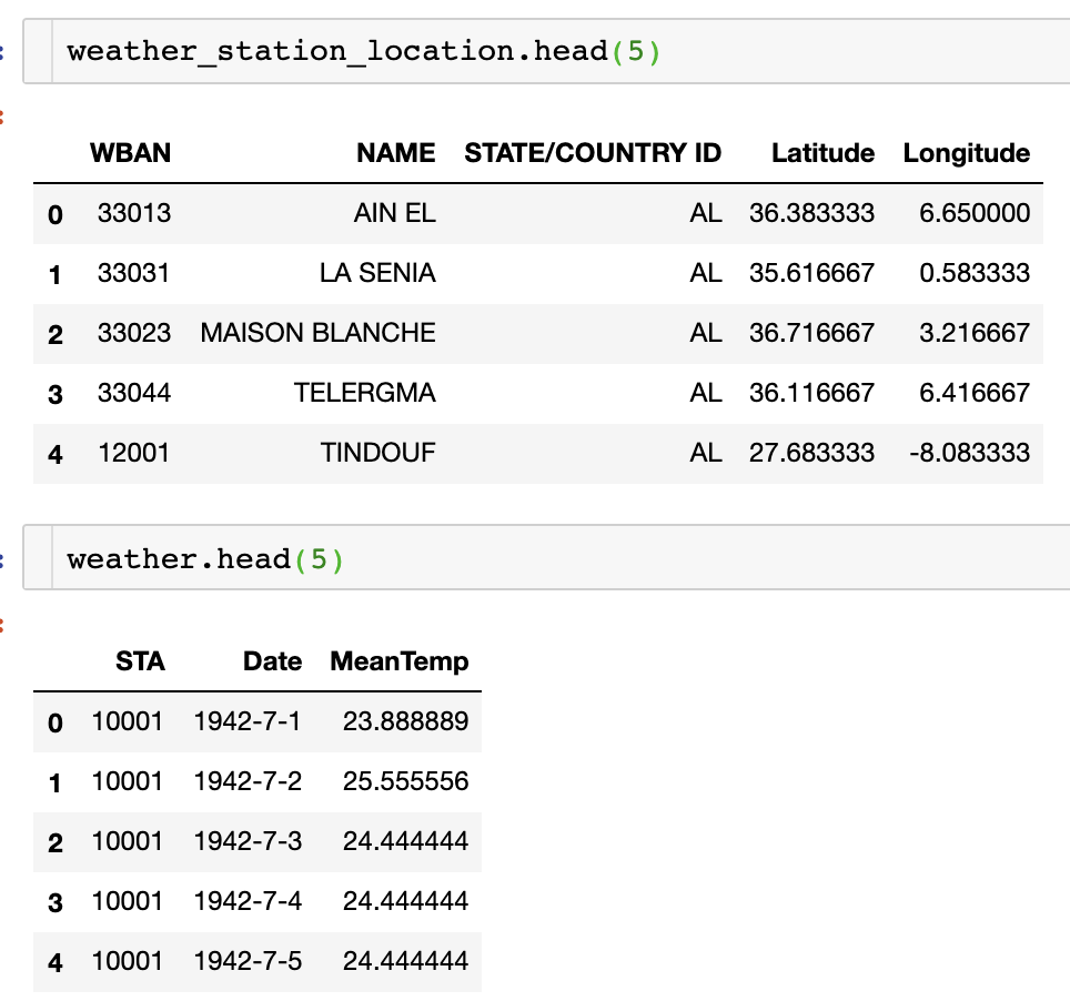
총 2가지 날씨 데이터이며, 하나는 station별 위도, 경도 등 위치가 표시되어있는 위치데이터,
하나는 station 별 실제 온도 데이터이다.
각 데이터별 사용한 컬럼에 대한 Description은 다음과 같다.
- Weather station location:
- WBAN: Weather station number
- NAME: weather station name
- STATE/COUNTRY ID: acronym of countries
- Latitude: Latitude of weather station
- Longitude: Longitude of weather station
- Weather:
- STA: eather station number (WBAN)
- Date: Date of temperature measurement
- MeanTemp: Mean temperature
필요한 라이브러리들을 import하고, 데이터를 불러온다.
import numpy as np # linear algebra
import pandas as pd # data processing, CSV file I/O (e.g. pd.read_csv)
import seaborn as sns # visualization library
import matplotlib.pyplot as plt # visualization library
# import plotly.plotly as py # visualization library
from plotly.offline import init_notebook_mode, iplot # plotly offline mode
init_notebook_mode(connected=True)
import plotly.graph_objs as go # plotly graphical object

import os
import warnings
warnings.filterwarnings("ignore") # if there is a warning after some codes, this will avoid us to see them.
plt.style.use('ggplot') # style of plots. ggplot is one of the most used style, I also like it.
weather_station_location = pd.read_csv("../01. Data/Weather Station Locations.csv")
weather = pd.read_csv("../01. Data/Summary of Weather.csv")
weather_station_location = weather_station_location.loc[:,["WBAN","NAME","STATE/COUNTRY ID","Latitude","Longitude"] ]
weather = weather.loc[:,["STA","Date","MeanTemp"] ]
분석에 필요한 컬럼들만 불러왔으며, 각 데이터에 대한 상위 5개를 head()로 보면 다음과 같다.
여러 지역 중 BINDUKURI 지역에 대한 일 평균 온도를 대상으로 분석을 진행하겠다.
weather_station_id = weather_station_location[weather_station_location.NAME == "BINDUKURI"].WBAN
weather_bin = weather[weather.STA == int(weather_station_id)]
weather_bin["Date"] = pd.to_datetime(weather_bin["Date"])
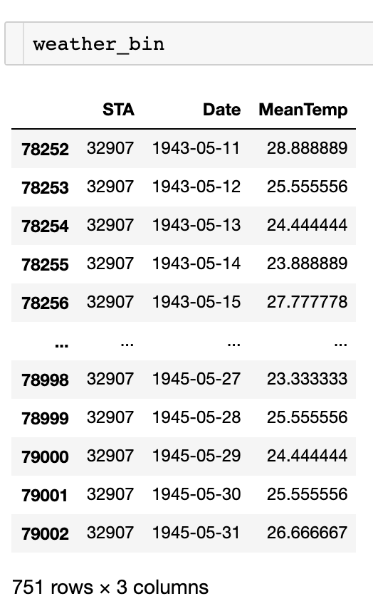
1943년 5월 11일부터 1945년 5월 31일까지 일단위 평균 온도이다.
이를 시계열 그래프로 그려보면 다음과 같다.
plt.figure(figsize=(22,8))
plt.plot(weather_bin.Date,weather_bin.MeanTemp)
plt.title("Mean Temperature of Bindukuri Area")
plt.xlabel("Date")
plt.ylabel("Mean Temperature")
plt.show()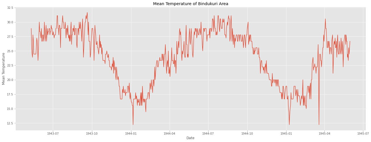
이를 시계열 분해법으로 분해해보면 다음과 같다.
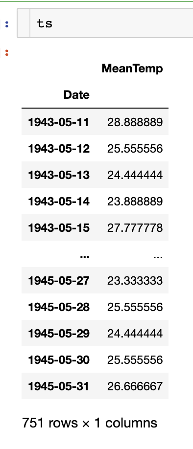
먼저, 시계열 형태의 ts 데이터를 만들어준다.
# lets create time series from weather
timeSeries = weather_bin.loc[:, ["Date","MeanTemp"]]
timeSeries.index = timeSeries.Date
ts = timeSeries.drop("Date",axis=1)
다음으로 seasonal_decompose() 를 활용하여 분해한다.
from statsmodels.tsa.seasonal import seasonal_decompose
result = seasonal_decompose(ts['MeanTemp'], model='additive', freq=7)

fig = plt.figure()
fig = result.plot()
fig.set_size_inches(20, 15)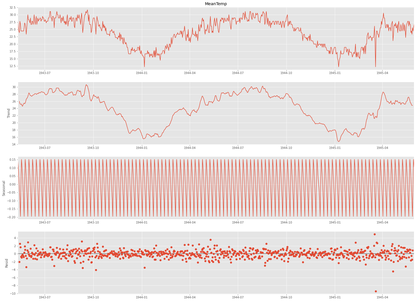
freq에 들어가는 주기는 계절성 주기를 기반으로 설정해준다.
이 계절성 주기는 정답이나 공식이 있는 것은 아니고 눈으로 보고 파악해야 하는데,
분기별 데이터는 4, 월별 데이터는 12, 주별 패턴이 있는 일별 데이터는 7로 초기 설정해보고 보면서 맞춰가는 것을 추천한다.
(이 데이터는 계절성 주기가 1년이라 365로 설정하는 것이 바람직하다.)
데이터가 패턴이 보이기 때문에 정상성이 의심된다. 이를 판단하기 위해 ACF 그래프를 그려보았다.
import statsmodels.api as sm

fig = plt.figure(figsize=(20,8))
ax1 = fig.add_subplot(211)
fig = sm.graphics.tsa.plot_acf(ts, lags=20, ax=ax1)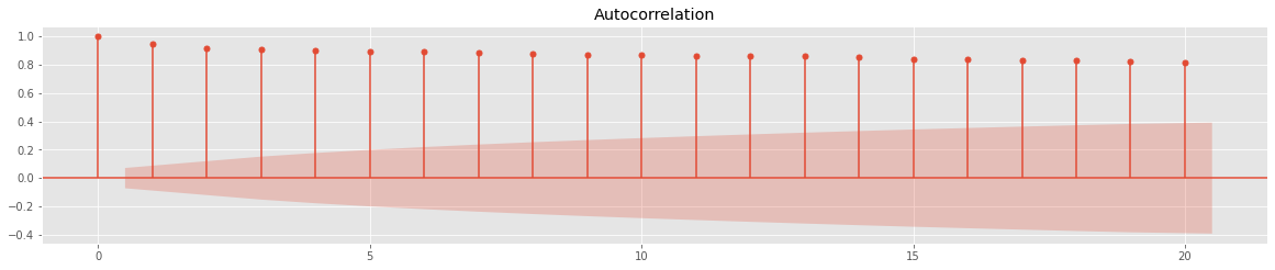
아주아주 천천히 값이 작아지는 것을 볼 수 있다. 이전 포스팅에서 언급했듯이, ACF 값이 아주아주 천천히 감소하는 것은 정상성을 만족하지 않는다는 것을 의미한다.
이번에는 단위근 검정인 ADF 검정(Augmented Dickey-Fuller test)으로 정상성을 확인해보겠다.
이 검정의 가설은 다음과 같다.
H0(귀무가설) : 자료에 단위근이 존재한다. 즉, 정상성을 만족하지 않는다.
H1(대립가설) : 자료가 정상성을 만족한다.
from statsmodels.tsa.stattools import adfuller
result = adfuller(ts)
print('ADF Statistic: %f' % result[0])
print('p-value: %f' % result[1])
print('Critical Values:')
for key, value in result[4].items():
	print('\t%s: %.3f' % (key, value))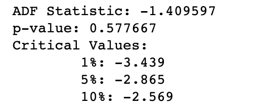
p-value가 0.05를 넘으므로, 귀무가설을 기각하지 못한다. 즉, 해당 데이터는 정상성을 만족하지 못한다.
이를 해결하기 위해 1차 차분을 해주었다.
ts_diff = ts - ts.shift()
plt.figure(figsize=(22,8))
plt.plot(ts_diff)
plt.title("Differencing method")
plt.xlabel("Date")
plt.ylabel("Differencing Mean Temperature")
plt.show()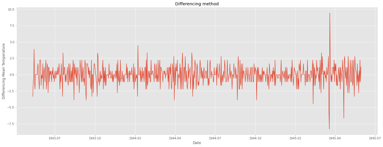
일정한 패턴이 확인되지 않고, 정상성을 만족하는 듯 보인다.
ADF 검정 결과는 다음과 같다.
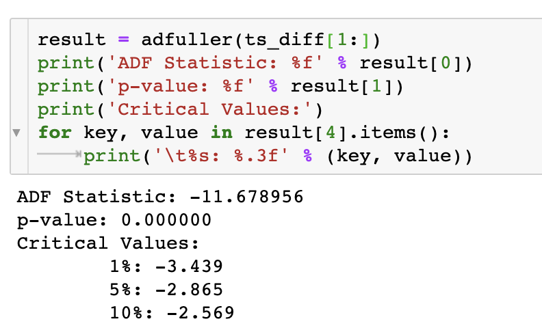
p-value가 0.05보다 작으므로 귀무가설을 기각한다. 즉, 1차 차분한 데이터는 정상성을 만족한다.
정상성을 만족하는 차분된 데이터로 ACF와 PACF 그래프를 그려 ARIMA 모형의 p와 q를 결정한다.
import statsmodels.api as sm

fig = plt.figure(figsize=(20,8))
ax1 = fig.add_subplot(211)
fig = sm.graphics.tsa.plot_acf(ts_diff[1:], lags=20, ax=ax1) #
ax2 = fig.add_subplot(212)
fig = sm.graphics.tsa.plot_pacf(ts_diff[1:], lags=20, ax=ax2)# , lags=40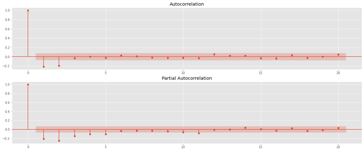
ACF와 PACF 모두 금방 0에 수렴하고, 2번째 lag 이후 0에 수렴한다.
즉, ARIMA(2,1,2) 모형을 base model로, ARIMA(2,1,1), ARIMA(1,1,2), ARIMA(1,1,1) 등의 모델을 시도해 볼 수 있다.
ARIMA(2,1,2) 모델의 결과이다.
1994년 6월 25일 부터를 Test했다. Obs로는 340개에 해당한다.
from statsmodels.tsa.arima_model import ARIMA
from pandas import datetime

# fit model
model = ARIMA(ts, order=(2,1,2))
model_fit = model.fit(disp=0)

# predict
start_index = datetime(1944, 6, 25)
end_index = datetime(1945, 5, 31)
forecast = model_fit.predict(start=start_index, end=end_index, typ='levels')

# visualization
plt.figure(figsize=(22,8))
plt.plot(weather_bin.Date,weather_bin.MeanTemp,label = "original")
plt.plot(forecast,label = "predicted")
plt.title("Time Series Forecast")
plt.xlabel("Date")
plt.ylabel("Mean Temperature")
plt.legend()
plt.show()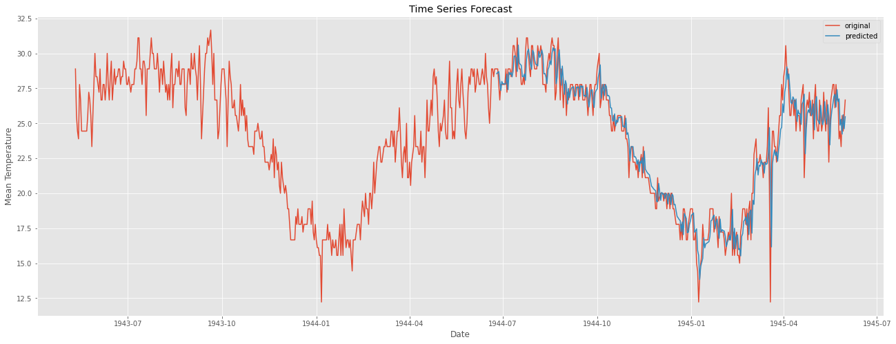
위 코드에서 중의할 점은 model fitting 시 typ = 'levels'로 해 주어야 한다.
차분이 들어간 모델의 경우 typ을 default 파라미터인 'linear'로 설정해 줄 경우 차분한 값에 대한 결과가 나오기 때문이다.
눈으로 볼 때 결과가 아주 좋아보인다. 마지막으로 잔차 분석을 통해 모델에 빠진 것이 없는지, 문제가 없는지 확인한다.
잔차는 어떠한 패턴이나 특성이 나타나서는 안된다.
어떤 패턴이 있다는 것은 모델에 그만큼 덜 적용이 되었다는 것을 의미하기 때문이다.
resi = np.array(weather_bin[weather_bin.Date>=start_index].MeanTemp) - np.array(forecast)

plt.figure(figsize=(22,8))
plt.plot(weather_bin.Date[weather_bin.Date>=start_index],resi)
plt.xlabel("Date")
plt.ylabel("Residual")
plt.legend()
plt.show()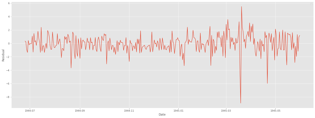
ACF 그래프 및 ADF 검정을 통해 정상성도 판단한다.
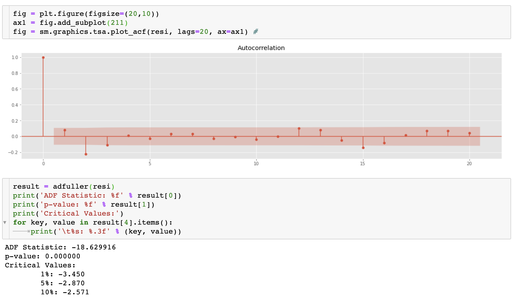
ACF 그래프도 빠르게 0으로 수렴하고, ADF 검정 역시 p-value값이 매우 작은 것을 볼 수 있다.
마지막으로 성능까지 확인해보면 다음과 같다.
from sklearn import metrics


def scoring(y_true, y_pred):
    r2 = round(metrics.r2_score(y_true, y_pred) * 100, 3)
    #     mae = round(metrics.mean_absolute_error(y_true, y_pred),3)
    corr = round(np.corrcoef(y_true, y_pred)[0, 1], 3)
    mape = round(
        metrics.mean_absolute_percentage_error(y_true, y_pred) * 100, 3)
    rmse = round(metrics.mean_squared_error(y_true, y_pred, squared=False), 3)

    df = pd.DataFrame({
        'R2': r2,
        "Corr": corr,
        "RMSE": rmse,
        "MAPE": mape
    },
                      index=[0])
    return df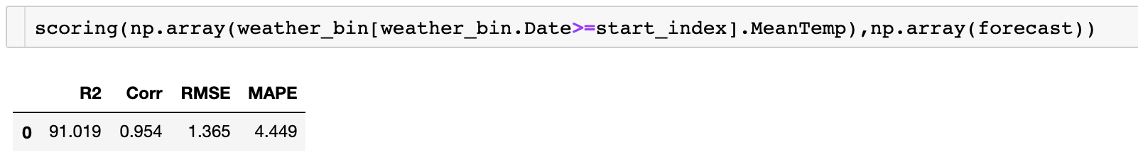
'AI > 시계열자료 분석' 카테고리의 다른 글
| Deep Learning for Time Series Forecasting (kaggle 코드 리뷰) (30) | 2021.05.27 |
|---|---|
| ARIMA란? :: ARIMA 분석기법, AR, MA, ACF, PACF, 정상성이란? (6) | 2021.05.24 |
| 시계열 분해란?(Time Series Decomposition) :: 시계열 분석이란? 시계열 데이터란? 추세(Trend), 순환(Cycle), 계절성(Seasonal), 불규칙 요소(Random, Residual) (0) | 2021.05.24 |
| [시계열 자료 분석] R에서 AirPassengers 데이터 선형계절추세모형 적합시키기 (0) | 2019.10.31 |
| [R] stl() 이란? :: stl parameter :: stl s.window (0) | 2019.10.29 |